
Updates
What has changed, and when
Newest first. HorseDex is on the App Store now. The entries below are what changed in each build, the earlier ones handed to testers through TestFlight before release.
Underneath HorseDex are the two apps it came out of, kept here because this journal has been going a good while longer than the app has. Tap any entry to open it.
HorseDex
From 10-08-2026
The app this site is about. It has been on the App Store for iPhone, iPad and Mac since 26 August, and every build is listed here.
Android, smoothed off
An Android-only update: buttons that respond without a grey box, a tab bar across the full width, and cards that scroll without a blurred shadow. iPhone and Mac stay on 1.4.2, which already has all of this. Android 75.
-
Android
Buttons dim gently when you press them. Pressing a button, a tab or a header icon used to flash a grey box the size of its touch area, which rarely matched the button itself. It now fades slightly under your finger and back, as it does on iPhone.
-
Android
The tab bar runs the full width of the screen. It used to float as a rounded bar with a hard line either side where the page stopped. It now sits along the bottom edge, as Android apps usually do.
-
Android
Cards no longer draw a blurred shadow. On Android each card's shadow meant drawing the whole card twice and blurring the copy, which slowed scrolling. The cards keep their outline.
-
Android
No dark flash when the app opens or the phone turns. With the phone in dark mode, the top of the screen went dark for about a second before HorseDex's own colours arrived. It now opens in them.
Forms that say what they need
Buttons that look greyed out when they cannot be used, forms that say what needs fixing, and tidier boxes and drop-downs on Android. iPhone build 72, Mac build 73, Android 74.
-
Track
Save measurement is greyed out until there is a number to save. It used to look ready and do nothing when tapped. Once a reading is saved, the box also lets go of the cursor.
-
Spending
An expense says what needs fixing before it saves. A How many that is not a whole number, or a cost that is not an amount, now shows in red, and Save stays greyed out until it is sorted. Before, Save simply did nothing.
-
Android
Password managers no longer offer to save an expense as a login. Android took the How many box for a PIN field, so a password manager could pop up after an expense was saved. It is now an ordinary number box.
-
Android
Cleaner boxes, drop-downs and sheets. Text boxes have one border instead of a box inside a box, drop-downs open as wide as the field, and the grey smudge over the search icon while a sheet was open is gone.
-
Log
Yes is purple, not red. Yes on extra curriculars and appointments showed in the red the app keeps for warnings. It is now purple and No is grey. The diary's arrows to the day before and after are clearer too.
Back where you expect it
Fixes for things Android testers ran into, and Settings pages that open inside Settings with a Back button on every device. iPhone build 69, Mac build 70, Android 71.
-
Android
HorseDex no longer closes when you switch away. With a well-filled journal, leaving the app for another one could make Android shut HorseDex down. Nothing you had saved was lost, and it now stays put.
-
Android
Back takes you to Log before it leaves. Pressing back on Report, Track, Care, Spending or Plan used to close the app. It now returns you to the Log tab first, the way other Android apps behave.
-
Settings
Settings pages open inside Settings, with a Back button. What you track, Reminders, Your data and About used to open as a second sheet on top, where Done closed everything at once. They now open in place, and Back returns you to Settings.
-
Button Shapes
The horse's name stays readable with Button Shapes on. On an iPhone with Button Shapes switched on, the header buttons grew and squeezed the name down to a couple of letters. They now keep their size.
Expenses that repeat
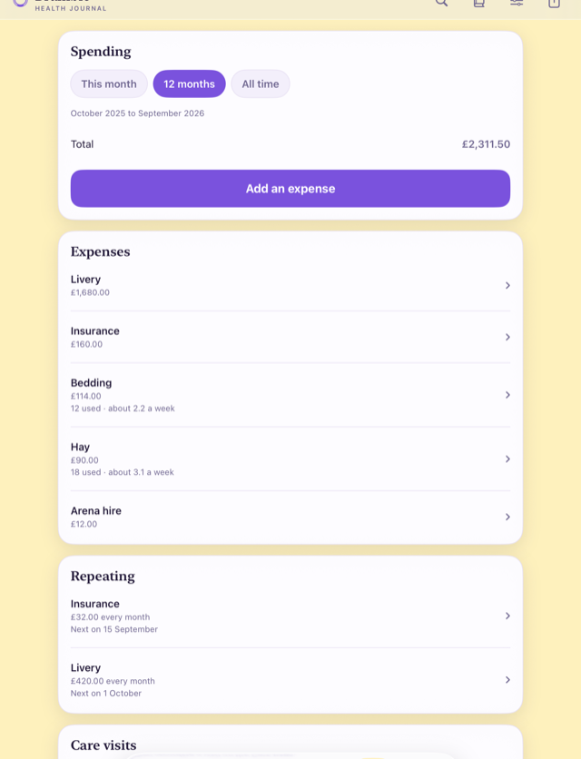
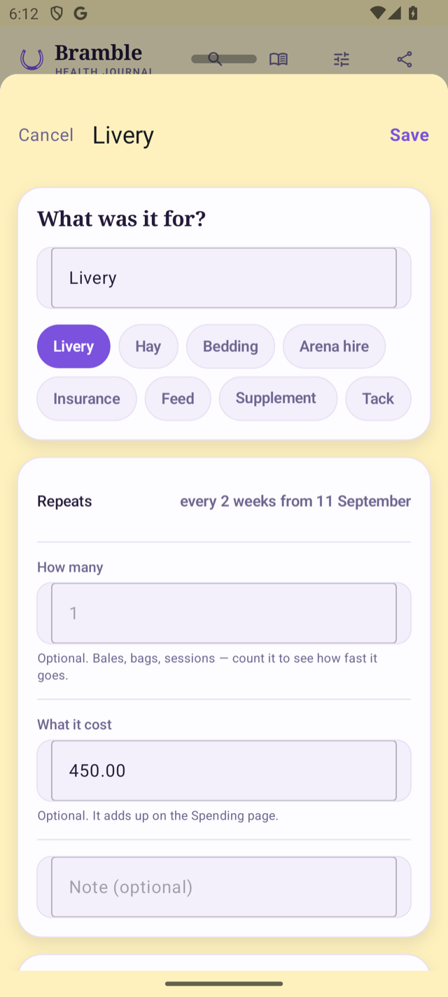
An expense can now repeat, for the costs that come round at the same amount, like livery or insurance. Each one is added on its date, so the total stays right without typing the bill in every month. iPhone build 66, Mac build 67, Android 68.
-
Spending
Livery and insurance can repeat. When you add an expense, switch on Repeats and choose every so many weeks or months. Each one is added to Spending when its date comes round, never ahead of time. If the first one was a while ago, the ones since then are added straight away.
-
Changing
A new price counts from the next one. Tap a repeat on the Spending tab to change what it costs or to stop it. The ones already added stay exactly as they were, and any single one can still be corrected or deleted without touching the rest.
-
VoiceOver
Weeks and Months are read out by name. Choosing how often something comes round, VoiceOver read both choices as just “Unit”. Each is now read as Weeks or Months.
-
Your data
Nothing you have already recorded has changed. Every repeat adds an ordinary expense, so it syncs between your Apple devices, goes in the backup and comes out in the spreadsheet export like any other.
The build going to App Store review
This is the build sent to the App Store for review, carrying the Spending tab. On iPhone and Mac nothing you can see has changed since build 61. iPhone build 63, Mac build 64.
-
Review
No change you will notice on iPhone or Mac. Build 61 brought the Spending tab. This one tidies how forms are opened behind the scenes so the Android app can reopen them empty, and goes to App Store review as version 1.3. Everything you have recorded is exactly as it was.
Spending gets its own page
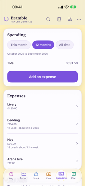
Spending has moved off the Care page onto a tab of its own, and it now takes everything a horse costs: hay, bedding, livery and arena hire as well as visits. Count how many you use and it shows how fast it goes. iPhone build 61, Mac build 62.
-
Spending
A Spending tab, for everything the horse costs. Bedding had been going on the care register because it was the only place a cost could be written down. Hay, feed, bedding, livery, arena hire, or anything you name yourself now has a home on its own tab. What you add to a farrier, dentist or vet visit on the Care page shows up there too, with nothing to copy across, and the total covers both.
-
Counting
Count what you use, and see how fast it goes. An expense can carry how many as well as what it cost, or either on its own. If you pay for hay from the yard with your livery bill, add how many you used and This month shows what you owe. If you buy in bulk, the tab shows roughly how many you get through a week. Once you have given something a price, typing how many fills in the cost for you.
-
Diary
Add the day's spending from the diary. Each day in the diary has a Spending card, so the hay can be written down as you go and corrected on the day. It stays off the picture and the page you share, print or email.
-
Your data
Nothing you have already recorded has moved. Visit costs stay on the visits where you entered them. Expenses sync between your Apple devices, go in the backup, and come out in the spreadsheet export.
Ready for iOS 27
The app is rebuilt for iOS 27 and macOS 27, and nothing else changed. Your journal, backups and settings are exactly as they were. iPhone build 59, Mac build 60.
-
iOS 27
Built for the new iPhone and Mac software. HorseDex is now made with Apple's tools for iOS 27 and macOS 27, so it is ready for the update arriving on phones and Macs this month. There are no new features and nothing has moved: every screen works the way it did in 1.2.
-
Mac
Resize it when you use your iPhone from your Mac. With iPhone Mirroring on macOS 27, the window showing HorseDex can now be made wider or narrower, and the journal lays itself out to fit instead of staying phone-shaped.
A journal that survives the phone
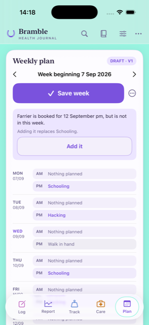
On Android the written record now travels in Android's own backup, so a new phone can bring it back. Backups stopped hoarding: one copy of each photo, a fixed number kept, and nothing written on a day nothing changed. A photo from the day can go on the picture you share, and the plan tells you when something you booked is not in the week. iPhone build 57, Mac build 58.
What is new
-
Android
Your journal is in Android's own backup now. Until this build the daily backup sat inside the app on Android, which meant uninstalling it, or losing the phone, took the copy with it unless you had chosen a folder. The written record now goes into your own Google backup as well, encrypted with your phone's own PIN or pattern, and comes back when you set up a new phone. Photographs are not in that route — Android will not store an app's backup at all once it grows past 25MB — so they still travel in the folder you choose, and the app now says so plainly and asks again if you said not now.
-
Backups
Backups stopped taking more room than they need. Every daily backup used to copy the whole journal and every photograph again, and nothing was ever cleared away. A photograph is now copied once, the last seven days plus one from each of four earlier months are kept, and a day when nothing changed writes no backup at all. Everything already backed up stays where it is and still restores.
-
Diary
The picture you share can carry the day's photo. A photo you added to a day can now sit at the top of the story or post the app draws for you. Where a day has more than one, a row above the buttons lets you pick which.
-
Plan
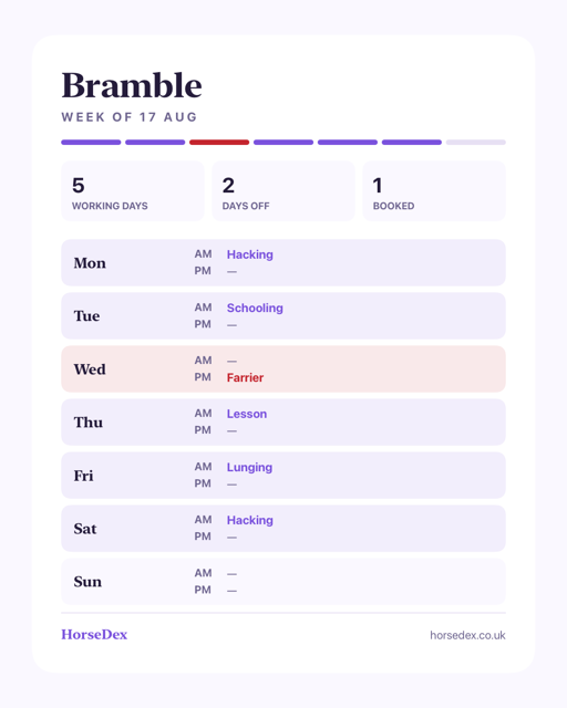
The plan says when something you booked is not in the week. A farrier booked after the week was filled in was not on it, and there was nothing to say so. The plan now tells you what is booked and missing, says what adding it would replace, and puts it in when you tap — a week you have arranged yourself is never rearranged behind your back.
-
Spending
One currency for the journal, and the totals say what they cover. Costs are read in a currency you choose, or the one your phone uses if you have not. The Care page also says which dates each total covers, and the chips that change the period now work on Android.
What it costs, and what you already know
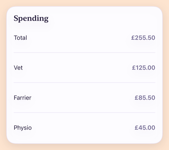
Care visits can carry what they cost, and the Care page totals them. Setting up now asks what is already known about your horse and switches on what those things are usually recorded with. Flu and tetanus are separate vaccinations, worming has moved to Care, and a diary day takes a photo. iPhone build 53, Mac build 54.
What is new
-
Care
A care visit can carry what it cost. Record a farrier, vet or physio visit and there is now a field for what you paid. The Care page adds them up per item over this month, the last twelve months, or all of it. Only visits that actually happened are counted, so booking one in and then recording it does not count the money twice.
-
Standing facts
Setting up asks what is already known. The first run now asks the things that are true about your horse before anything is logged — whether she is a mare, whether there is a diagnosis you already live with — and switches on what those things are usually recorded with, telling you which ones it turned on. Ticking one months later does the same thing.
-
Vaccinations
Flu and tetanus keep their own dates. They were one entry on one clock, which meant a date covering two things that fall due at different times. They are now separate, on twelve months and twenty-four months. The batch number is no longer asked for — the passport already holds it.
-
Worming
Worming has moved to the Care tab. It sat on the daily log, where it read as something to do today. It now lives in the care register with the rest of the visits, where the product used is asked for. Everything already recorded is still there.
-
Diary
A day can take a photo. Alongside the note on a diary day there is now room for a picture — a leg, a rug, a field, whatever the note is about.
-
Reminders
Two diary reminders instead of one. A morning one and an evening one, each with its own time and its own switch, so the app can nudge you when you go out and again when you come in.
-
More than one horse
One visit, recorded across several horses. The farrier comes for all of them on the same morning. Record it once and tick the horses it covered, and each one gets its own row in its own register.
-
Backups
Your backups show up in Files. On iPhone, iPad and Mac a HorseDex backup is now somewhere you can see it, under HorseDex in the Files app, rather than being a thing only the app could find. Backups already made are still read from where they were, so nothing is lost.
-
Share
The week card looks like the diary card. The picture of a week you can share was plain grey next to the diary one. It now carries the same colours, and both cards keep clear of the buttons a story puts over the top and bottom.
Fixed
-
Saving
A cost typed the way it is written is saved the way it is written. A bill entered as 5,000 was being read as five pounds, quietly, with nothing on screen to say so. It is now read as five thousand.
-
Android
A message from inside a sheet reaches you. When something went wrong while recording a care visit, the explanation never appeared — the sheet simply sat there. It now says what happened. Tapping away from a field also puts the keyboard away again without closing the sheet.
-
Large
Rows of chips stay whole at large text sizes. Turning the display size up broke chip labels mid-word and left one chip stranded on a row of its own. They now divide evenly and stay readable.
-
Share
A busy day fits on the share card. A day with a lot on it ran off the bottom of the picture. It fits now.
-
Sync
Two devices disagreeing settle by the clock. When two devices had both changed the same record, whichever tried last used to win. The newer change now wins, and a field one device has never held is no longer removed from the other.
The Log form keeps its place
A half-filled entry now survives an interruption, clearing the activity no longer stops an entry saving, and a save that fails says what went wrong. iPhone build 51, Mac build 52.
-
Log
A half-filled entry survives an interruption. Lock the phone part-way through logging the day, or step away and come back to find the app has closed itself, and everything you had typed was gone. What you have entered is now kept as you type it, and the form comes back as you left it.
-
Log
Clearing the activity no longer stops an entry saving. Choosing an activity, then clearing it again, left a lesson tick behind that you could not see, and the entry then refused to save. Clearing the activity now clears everything that hangs off it.
-
Log
A save that fails says so. When saving went wrong the form could still close as though it had worked, so the day looked recorded when it was not. It now stays put and tells you what happened.
Fixes before the shop opens
A dose recorded on the wrong day can now be removed, trends no longer colour your numbers good or bad, the About page has its own website and privacy sections, and a set of behind-the-scenes fixes make syncing and restoring safer. iPhone build 47, Mac build 48, Android 47.
-
Care
A dose given by mistake can be removed. Recording a dose was one tap, but a dose recorded on the wrong day was there for good — a tester found there was no way back. Each entry in a medication’s history now has a remove button beside it.
-
Report
Trends no longer colour your readings good or bad. A weight or a score used to turn teal or rose depending on which way it had moved, and could read “on target” or “trending away”. HorseDex records, it does not judge, so a trend now says plainly whether it is up, down or steady since the last reading, and shows the target you set as a number.
-
Export
The written summary names each measurement properly. The plain-text summary you can share listed every reading as a weight in kilograms, so a body condition score went out as “5 kg”. Each type of reading now appears under its own heading, with its own unit and scale.
-
About
About, the website and the privacy policy each have their own section. One page, three cards: what the journal is and is not, where to find the website, and the privacy policy with the promise that there is no account and no server of ours.
-
Sync
Two devices agree about what you deleted. Something removed on one device could reappear later from a copy the other device still held, and a change arriving from another device could quietly blank fields it did not know about. Both are fixed; nothing you already have is touched.
-
Backup
A restore that fails leaves your journal as it was. Restoring used to write over the live journal as it went, so a damaged backup file could leave you with half of one. It now checks the whole backup first and only then swaps it in. A backup from the old private app that cannot be read now says so instead of closing the app.
-
Stability
If the journal cannot be opened, the app says so. A damaged journal file used to close the app on launch with nothing to see. It now opens to a card that explains, so you can restore from a backup rather than guess.
A header that fits, and dose reminders through the day
Three fixes: the header no longer spills off a smaller iPhone, a twice-daily course now reminds you twice a day, and a search result on a note can open the whole day. iPhone build 45, Mac build 46.
-
Everywhere
The header fits every phone. On an iPhone 14 Pro and other smaller screens the horse’s name and the icons beside it ran past the edge. A shorter arrangement now steps in when the wide one does not fit.
-
Care
A course given more than once a day reminds you each time. A dose reminder only fired for intervals of a day or more, so a twice-daily course never said anything. A reminder now goes off at the moment the next dose is due.
-
Search
A note found by search can open the day. A result that matched a note now asks the same as any other result: the entry, or that whole day in the diary.
Reminders you asked for, and a week you can share
Care items with no set interval no longer show a switch that cannot be turned on, medication reminders became yours to choose, the log opens on the last week, and the plan can go out as a picture.
-
Care
A switch that could not be switched is gone. Vet, massage, clip and weighbridge arrive with no set interval, and the reminder switch beside them was greyed out with nothing to say why. Those rows now offer Set an interval instead. Choose how often it comes round and the switch appears, working.
-
Care
Medication reminders are yours to turn on. A course with a dose interval or an end date used to remind you whether you had asked it to or not. Each one now carries its own switch, off until you say otherwise. A course that has finished does not offer one at all.
-
Log
The log opens on the last seven days. It listed everything, which grew into a long scroll on a journal with any history behind it. It now shows the past week, with Show earlier entries underneath. Nothing has been removed — the diary, the report and the export are all unchanged.
-
Search
A result can open the day, not just the entry. Asking when you last did something took you straight to the entry itself. Now it asks which you wanted: the log entry, or that whole day in the diary.
-
Plan
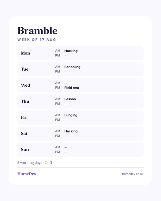
The week can be shared as a picture. The plan gets the same two shapes the diary has — a tall one for a story, a portrait one for a post — with the seven days and what is on them drawn onto a card.
-
Android
Turning the phone sideways and back no longer breaks the screen. Going to landscape and returning to portrait left the page drawn at the landscape size, with the bottom of the screen black and the tab bar half off the edge. It lays out properly again on the way back.
-
Mac
The desktop widgets stay readable behind another window. When any other window had focus, macOS redraws desktop widgets in a paler style, and the coloured panels inside ours turned into solid white blocks with the text on them wiped out. The panels step aside in that mode so the words survive.
The screen that keeps your journal safe
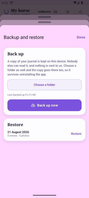
Three fixes and nothing else: Backup and restore now opens wherever you tap it, it says plainly where your copy lives, and the Mac app finally calls itself HorseDex.
-
Your data
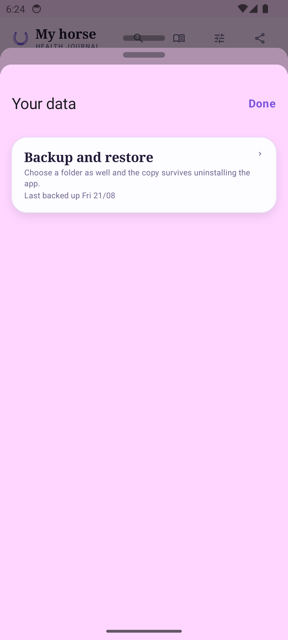
Backup and restore opens wherever you tap it. It used to answer only on the small arrow at the right-hand edge of the card. Tapping the words did nothing at all, on the one screen that leads to a backup — so it was easy to conclude the feature was broken. The whole card opens it now.
-
Your data
Clearer about where your copy actually lives. The copy kept on your device goes when the app does, which the wording did not say. It now tells you to choose a folder as well, because the copy there survives uninstalling. On Android the settings row no longer mentions syncing between devices either — that has always been an iPhone and iPad feature.
-
Mac
The Mac app is called HorseDex. It installed under the old name it was built from, while the iPhone app was always HorseDex. Only the name changes — your horses, entries and photographs are untouched.
The app, tidied end to end
The whole review lands: every page calmer, nothing you rely on removed. iPhone build 37, Mac build 38.
-
Settings
Settings is now four clear pages. What you track, Reminders, Your data and About each have their own page, with your horses and the journal lock up front. Everything that was there before still is — backup and sync now live together on Your data, and the diary reminder switch sits beside its time.
-
Log
A shorter path to logged. Duration is one row. The AM and PM chips and the yes/no questions stay exactly where they were — testers told us they earn their place.
-
Care
Rows that fit. No more doubled-up tags on things never recorded, the reminder explanation is said once at the top, and removing a medication course now offers Undo instead of asking twice. Dates and reminder switches stay on every row.
-
Plan
One button that knows where you are. Start, fill, save or reopen — the button matches the week's state, with the rarer choices behind the dots beside it. The week arrows moved up beside the title.
-
Report
Day by day, down the page. The sideways table is gone — days stack most recent first with a Show all toggle. Comparing two fields now lives on each chart, and the cards balance across columns on wide screens.
-
Diary
The diary stays its own place. As requested — it is not merging into the log. Its reminder switch moved to Settings where the time already lived.
Fixes across the board
Eighteen fixes from the app-wide review, shaped by your feedback. iPhone build 35, Mac build 36.
-
Log
Notes type properly on Android. Typing into the Notes box could freeze the app on Android — the note never made it in. Fixed; notes are single-line there for now.
-
Log
Odd names are gone. If a custom activity had been removed, old entries could show an internal name like own_lesson in the diary. Everything now shows a proper name, and removing an activity warns you how many entries use it first.
-
Care
Bookings ask morning or afternoon. Booking an appointment used to land on PM silently. It now asks — and changing a booking moves it instead of quietly adding a second one.
-
Diary
Done keeps your note. Tapping Done on the diary now saves what you wrote. The picture buttons are also always there while a picture is being drawn, and the share picture for feeds is now portrait, matching Instagram.
-
Report
Honest windows, tidier charts. The two cards that always show the current week now say so under their own This week heading; bars no longer merge two days that share a date label; dates in sentences read like dates.
-
Track
Editing opens its own sheet. Editing a measurement no longer fills a form off the top of the page — it opens in front of you, and a score keeps the scale it was given on.
-
Export
The date range holds. The From date no longer springs back to the last seven days when the calendar closes, so a vet gets the week you actually picked.
-
Sync
Pull down to sync on iPhone. Any page pulls down to sync on iPhone. The Mac keeps its sync button. Backups also now say on the settings page when they last succeeded — or if one failed.
Every horse keeps its own
Two fixes for anyone keeping more than one horse: the target weight and the daily must-do list each stay with their own horse now, instead of bleeding between them.
-
Report
The target weight belongs to one horse now. With more than one horse, the target you typed on the Report page was shared between them — set it for one and it appeared for the other, and changing it there changed it back. Each horse now keeps its own target. The one you had already set stays with the horse you are viewing when you first open this build, so nothing is lost — just check it landed on the right horse.
-
Log
Daily must-dos stay with their horse. Switching horses could leave the previous horse's must-do list showing on the Log page, so something added for one horse appeared under the other. The list now follows the switch properly. Everything you ticked or added was always saved against the right horse — it was the screen showing the wrong list, and your records are untouched.
Sync recovery
If your journal was not fully up to date on a second device, tapping Sync now will now catch it up completely. One fix, and nothing else.
-
Sync
Sync now pushes everything the cloud is missing. A behind-the-scenes issue could leave some entries and care records stuck on the device that created them, even though both devices reported zero pending changes. Tapping Sync now in Settings will now re-check and send anything that was missed. Your existing records are untouched.
-
Care
The date picker in Care stays open when you tap nearby. Tapping near the edge of the date popover used to close it. It now stays put until you pick a date or tap clearly outside it.
Seamless multi-device journal switching
When syncing data from another device, the app now automatically switches to your active horse and pulls through all journal entries and care history without leaving empty duplicate profiles. The iPhone and iPad build of this work is build 29, and the Mac build is build 30.
-
Multi-Device Sync
Synced journals load immediately on secondary devices. When setting up HorseDex on a second device, your synced horse and all its entries, care routines, and plans now immediately connect and display as soon as they arrive from iCloud.
Sync, Care booking, and responsive layout on Mac
Build 28 brings live CloudKit push synchronization, the expanded sync dashboard, the Care booking date picker fix, and chart display improvements to macOS.
-
Mac & iOS
All recent sync, care, and layout updates on macOS. The Mac app now features full background push sync, the expanded sync dashboard in Settings, the one-tap header Sync button, and the rebuilt Care booking date picker. Charts also display with clearer spacing and clean date axes across longer reporting periods.
A cleaner header on compact screens
On smaller phones, the top navigation bar now keeps your horse's name and journal title cleanly on single lines, moving secondary actions into a compact menu so the buttons never crowd the header.
-
Header Layout
No more squished titles on compact phones. We updated the top bar with a responsive layout. On smaller screens, the horse title is protected from wrapping vertically, while Search, Diary, and Settings stay front and center. Sync and Export are now neatly tucked into an overflow menu on phones, while expanding to individual buttons on wider screens like iPads and Macs.
Instant multi-device sync, and reliable care booking
Changes made on one device now arrive instantly on another through Apple push notifications, with a new front-page sync button and live status in Settings. The care booking date picker has also been rebuilt so selecting an appointment date responds every time.
-
Live Sync
Changes appear instantly across your devices. The app now registers for silent Apple push notifications, meaning a journal entry saved on your phone shows up on your iPad straight away without waiting for a manual reload. When you reopen the app, it also checks for and pulls down any new entries in the background.
-
Sync Dashboard
A dedicated sync button and live sync details. You'll now find a Sync button on the front page header beside the diary and settings icons for an instant one-tap refresh. In Settings, the sync area now displays your live sync status, a relative timestamp of when data last synchronized, and a Sync now button.
-
Care Booking
Care appointment date picker responds immediately. We fixed an issue where tapping to select an appointment date on the Care tab would not respond. The booking sheet now uses the standard date picker and saves directly to your care schedule.
Care booking dates, and a smoother Android ride
You can now record exactly when a farrier or vet visit is booked for, right on the Care tab. For our Android beta testers, this build clears out a handful of crashes and layout bugs, and sharing plain text is finally working.
-
Care Booking
Log a booked date before the visit happens. There is a new section underneath each care routine that lets you pick the date your vet, farrier, or dentist is booked for. The list still works exactly as it did before — you can still tap Record on the day — but you now have a place to put the date the moment you make the appointment.
-
Care layout
The 'Remind me' toggle wraps out of the way. If you have a lot of history tags on a care routine, the toggle to turn reminders on used to get squashed. It now neatly drops to the line below if it runs out of space, leaving the tags readable on any screen size.
-
Android
Crashes fixed and toggles untuck. For testers on Android, we've fixed the bug that crashed the app when scrolling past an empty list on the report or settings page. The notification bar now sits safely above your tabs, tapping a switch moves it immediately, and the 'Share this page' button reliably hands your text over to the system instead of doing nothing.
A lesson counts as a session, and the week reads like a week
Book a lesson and the weekly plan now treats it as one of your sessions instead of adding another one beside it. Anything in your library can be booked to a day, quiet days have something to fill them with, and the plan has been laid out again from scratch. The iPhone and iPad build of the same work is build 23.
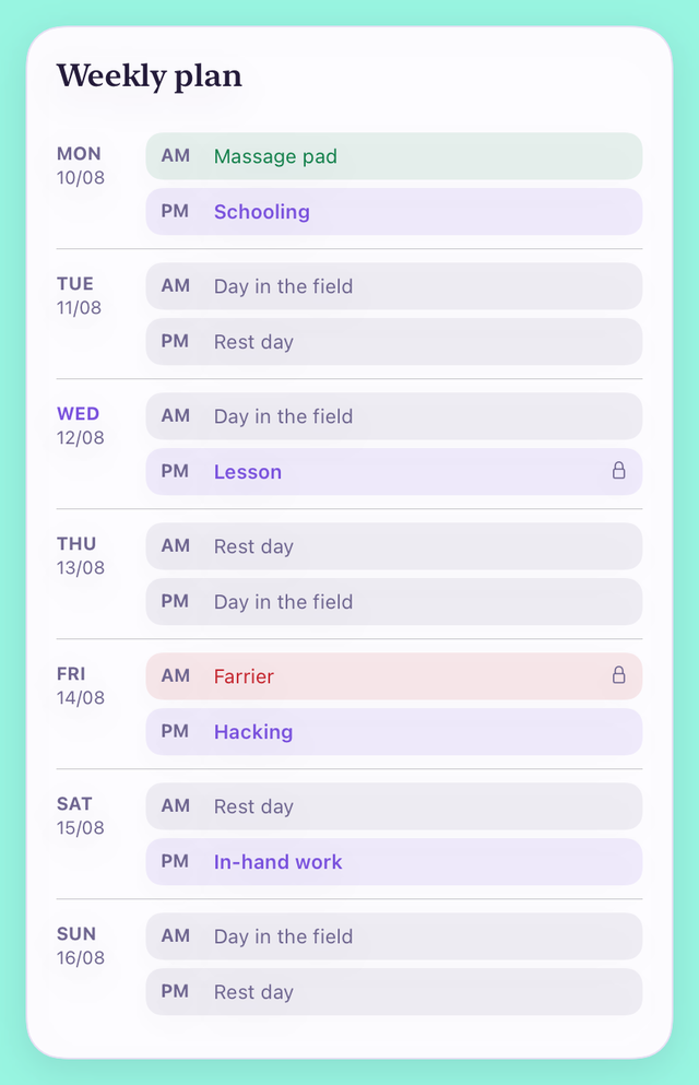
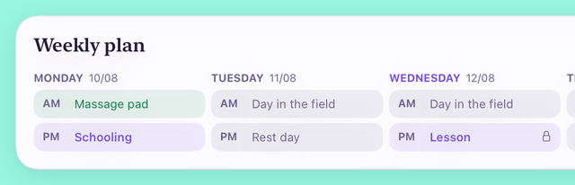
The weekly plan
-
Lessons
A booked lesson is one of your sessions, not an extra one. Before, a lesson could only be booked as an appointment, so the plan did not treat it as work — it would fill the other half of that day with lunging and then tell you the week was still short. A commitment now keeps whatever it actually is, so a lesson counts towards how often your horse works and towards how many days in a row it may.
-
Book anything
Not just the farrier and the vet. Fixed commitments used to be limited to the care list. A lesson, a hack with a friend, a session with someone who rides for you — anything in your library can now be pinned to a day and a half of the day, and it stays put while the rest of the week is filled around it.
-
Box rest
Days you have recorded as box rest stay clear. If an episode has box rest running across part of the week, the plan leaves those days alone and says so, rather than putting schooling on a day your vet has your horse confined. Nothing is decided for you — it reads the dates you entered on the episode.
-
Quiet days
There is finally something to pick from. “What can fill the rest of the week?” shipped with nothing in it, so most weeks came back with half their slots empty. There are now four to choose from — a day in the field, a rest day, a hand graze and a groom — alongside anything you have added yourself.
How it looks
-
On a phone
One row per day, and nothing squeezed into a column. The plan was a three-column table, and on a phone that left two cells about a thumb wide — long enough for “In-hand” and then a second line for “work”. Each day now has the day down the left and its morning and afternoon written out in full, colour-coded by what they are, with a small lock on anything fixed.
-
On a wide screen
The whole week across, on an iPad on its side or a Mac. Given the room, the seven days sit side by side as a week rather than a list you scroll, with every morning on one line and every afternoon on the next so they line up across the days. Narrow the window and it goes back to the stacked rows.
Fixed
-
A second device
What you logged on your phone now shows up on your other device. If you installed HorseDex somewhere new — a Mac, a second iPad — it could sit on its own empty horse while your real journal arrived quietly behind it, so the app looked like it had never synced. Your records were never lost or altered; they were there and out of sight. The new device now lands on the journal that arrived, and an install already stuck this way sorts itself out next time you open it.
The same work, for iPhone and iPad
Build 24 above, built for iPhone and iPad. The two are made separately and carry separate numbers.
-
iPhone and iPad
Build 24's changes, on the phone and the iPad. The Mac build and the iPhone build are archived separately and each takes the next number, so one piece of work lands as two entries. Everything listed under build 24 is in this one.
Room to spread out, and a version number
On an iPad held sideways the pages now use the whole screen: the five tabs move to a list down the side, and cards sit two abreast instead of one long column. On an iPhone nothing changes. The version number becomes 1.0.
-
On a wide screen
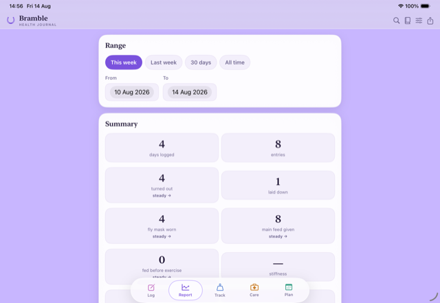
The tabs move to the side, and the cards sit two abreast. Turn an iPad on its side and the floating bar at the bottom is replaced by a list of the five pages down the left, always visible. The Report, Care, Track and Plan pages lay their cards into two columns and keep them level, so you see far more at once without scrolling. Everything is where it was; it just has room.
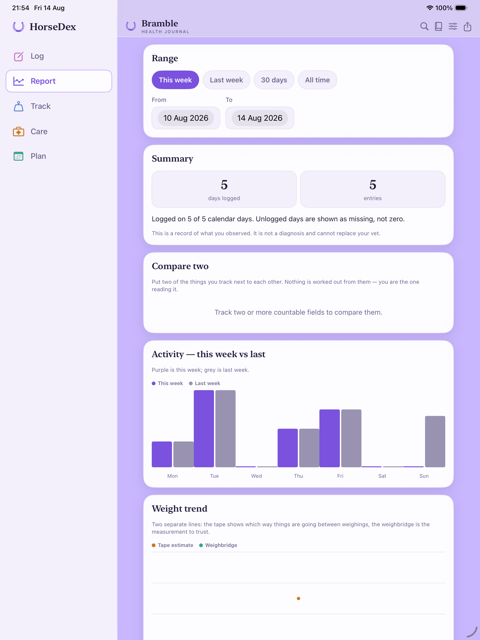
Report on an iPad, with the pages down the side -
On an iPhone
Nothing changes. The phone keeps the bar along the bottom and the single column of cards. The new layout only appears when the screen is genuinely wide enough for it, so it is the same app in your pocket.
-
Version
HorseDex is 1.0. The version reads 1.0 rather than 0.1-something. Nothing about your journal changes — it is the number the App Store will carry when the app is released.
HorseDex on the Mac
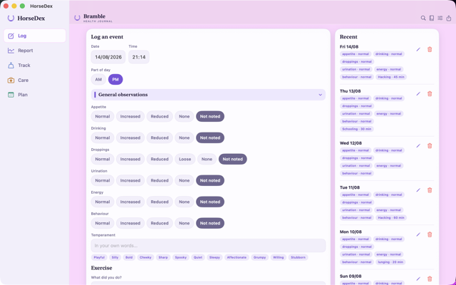
The first build for macOS. The same journal, the same records, in a window you can size — with the five pages listed down the side and cards laid out two abreast.
-
On the Mac
The same journal, in a proper window. HorseDex now runs on macOS. It is the same app rather than a stripped-down one: every page, every record, the vet report and the backup all work the way they do on the iPhone. Sign into the same iCloud and what you wrote on the phone is already there.
-
Laid out wide
Pages down the side, cards two abreast. A Mac window is far wider than a phone, so the five pages sit in a list down the left instead of a bar along the bottom, and the cards fill the width in two columns that stay level with each other. Drag the window narrow and it goes back to the phone layout.
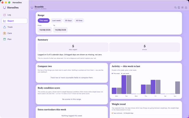
Report on the Mac, with the week's activity and weight side by side
Your journal, on every device
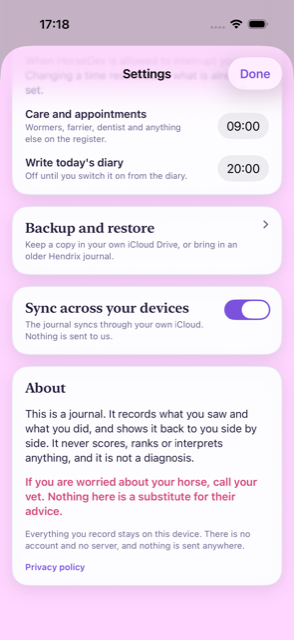
HorseDex now syncs. An entry made on the iPad appears on the iPhone and on any device signed into your iCloud — no account with us, no server of ours, and a switch to turn it off.
-
Sync
Record on one device, read it on the others. Entries, care visits, episodes, medications, measurements, plans, diary notes, your own fields and activities, and photos all travel between your devices now. It works through your own iCloud: we run no server, hold no account, and cannot see your journal — the same footing as the backup has always had. Videos are the one exception; they stay on the device they were taken on, as they already did in backups. We are switching sync on behind the scenes as this build reaches you, so if your devices are not talking to each other on day one, give it a day and they will be.
-
How it settles
The newest edit wins, wherever it was made. If the same thing is changed on two devices, the more recent change stands. Restoring a backup makes that restored journal the truth everywhere — the other devices follow it rather than arguing with it. A brand-new device starts by pulling your journal down, never by overwriting it with an empty one.
-
Your choice
A switch, not a condition. Sync is on from the start so it just works, and Settings has the switch to turn it off. Off means off: the journal stays on the device, the daily backup carries on as before, and nothing else changes.
Search takes you there, and HorseDex comes to iPad
A search result now opens the record behind it. The app runs on iPad and sideways on any iPhone, and starting fresh on a new device offers the backup in your iCloud instead of a blank journal.
-
Tap to open
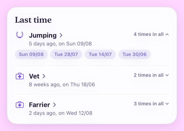
A search result opens the thing itself. Ask when you last jumped and the answer is no longer just a date — tap the result and you are looking at it. An activity or an observation opens the entry it was recorded in, a care item opens its history, an episode opens its story, a medication opens what was given, and a measurement takes you to Track. Search closes behind you. The little count on the right still unfolds every date it happened.
-
On iPad
HorseDex now runs on iPad — upright or sideways. The same journal, the same pages, laid out for the bigger screen: cards keep a readable width instead of stretching edge to edge, and everything works whichever way the iPad is held. iPhones can turn sideways now too. Nothing about your records changes — it is the same app on every screen.
-
A new device
A new device now offers your backup, not a blank journal. If you lose your phone, replace it, or open HorseDex on an iPad for the first time, the first screen now waits a moment for your iCloud to catch up and then offers the most recent backup — one tap brings your journal back, photos included. What comes across is your latest backup, which HorseDex writes daily, rather than a live copy of the other device. You can skip it and restore later from the Backup screen.
Your words, your times, and a day you can post
Temperament and feed are yours to describe rather than pick from a list, both reminders happen when you say, and a day can go out as a picture. A note can also wait as a draft until you are happy with it.
-
As a picture
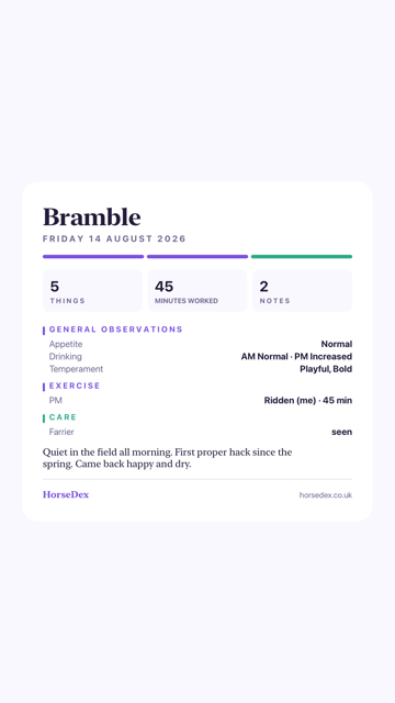
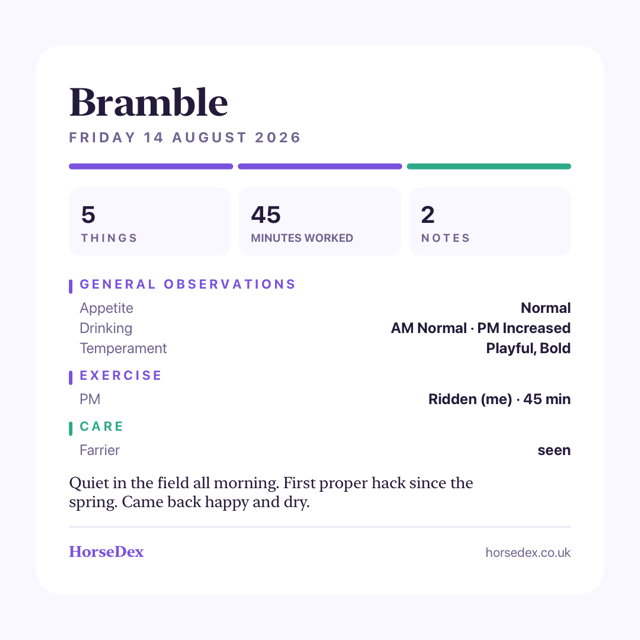
Share a day as a story or a post. The Diary can now draw the day as an image — tall for a story, square for a post — and hand it straight to whatever you share with. It carries the same day the screen shows: the horse, the date, what you recorded and anything you wrote. Whoever sees it sees all of that, so it is worth a look before it goes out.
-
In your words
Temperament, and what was actually fed. Two new things to record, both free text rather than a list to choose from: how they were in themselves, and what went in the bucket. Words sit under each box — playful, silly, bold, hay, balancer — and tapping one adds it, tapping it again takes it away. Type over them and it keeps exactly what you typed. Temperament is on from the start; what was fed arrives with the Feed group.
-
Drafts
Finish a note tomorrow. The note you write about a day now has two buttons. Save as draft keeps it on your own screen, marked as a draft, and leaves it off the page you share, print or email. Save and submit puts it on the day properly. A note you never submitted is held as a draft rather than published on your behalf, so nothing half-written goes to a vet.
-
The diary
A day reads morning first again. Where you had recorded something twice in a day, the diary printed the evening before the morning — so a field read "PM warm · AM normal", and the exercise ran backwards with it. It reads forwards now, on screen, on the printed page and in the email. Nothing you have already recorded changed; only the order it is read in.
Around the app
-
Reminders
Choose when HorseDex speaks up. Care reminders always arrived at nine in the morning and the diary nudge at eight in the evening, with no way to move either. Both are now yours to set in Settings, to the minute, and changing one reschedules what is already waiting.
-
Must-dos
A daily tick list, if you want one. You can write your own list of things that have to happen every day — skip out, check water, whatever yours are — and tick them off on the log screen. It starts empty and stays hidden until you write one, it clears itself each morning, and it never appears in the report your vet reads. It is a routine, not a record.
-
Small things
Buttons say when they are working. Saving, logging an entry and preparing an email now show that something is happening and then that it worked, instead of sitting still and leaving you wondering whether the tap registered. Tapping anywhere off a text box also puts the keyboard away.
The report your vet reads, redrawn — and sendable without saving a file
The vet report and the diary are proper documents now rather than lists, and either can go to your vet in an email with the PDF already attached. The planned week fills itself in completely, too.
-
The report
It reads like a document now, not a list. The report opens with your horse's name and the dates it covers, then a row of figures — days logged, entries, the latest weight, anything already ongoing. Under that come the things you have recorded as true of your horse whatever the month, then what was already running before the period started, then every day as a proper table. Each kind of measurement gets its own small chart. Everything that was in the old report is still in it.
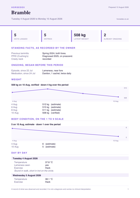
The report as it prints now. Every horse and reading here is made up. -
Straight to your vet
Email it without saving a file first. Export and the Diary each have an Email button. It opens your mail app with the record written out in the message itself and the PDF already attached, so your vet can read it without opening anything. Nothing is sent until you send it.
-
The diary
A day fits on one page. The diary now opens with a strip showing how much you recorded, how long you worked and how many notes you wrote, with the day's entries tighter underneath and each group in its own colour. Printed or emailed, a day fits a single page — and it steps the type down to keep it there on a busy one.
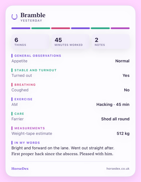
A day in the Diary. Made-up horse, made-up records. -
Weights and scores
A condition score is no longer reported as kilograms. If you record a body condition score as well as a weight, the report used to print every reading as kilograms, so a score of 5 read as "5 kg". Each kind of reading now keeps its own units, and a score always says which scale it was given on. The 1 to 5 and 1 to 9 scales are never drawn as one line.
-
The week
The planner fills the whole week. A generated week used to leave half of every day empty. Now every free half-day is filled: your sessions where you ride, each extra you have ticked used once before anything comes round again, and your quiet days carrying the rest. Your fixed commitments are left where they are, and every other slot is still yours to swap.
-
Small things
The horseshoe is back, and screens stop redrawing themselves. The mark at the top of the app was missing on iPhone, and so was the one on the home screen widgets. Coming back from another app no longer leaves a screen half-drawn, and a long field name on the report no longer prints over the value beside it.
The fix for builds 14 and 15 not opening
Builds 14 and 15 closed the moment you tapped them. Nothing you had recorded was affected, and this build opens normally — please update to it.
-
Fixed
The app opens again. Builds 14 and 15 shut down instantly on every phone, before anything of the app had started. A piece the app needs to run was left out of the build itself, so your phone loaded it, found the piece missing and closed it straight away. This build carries it. If you were stuck on 14 or 15, update through TestFlight and it will open as normal.
-
Your records
Nothing you wrote was touched. The app never got as far as opening your journal, so nothing could have been changed or lost by this. Everything is where you left it, including anything recorded on build 11 or earlier.
-
Everything else
And with it, everything build 14 was meant to bring. The Diary, the search, the folding log sections, the turnout question, the report switches and the week that fills itself in were all in build 14 and have been unreachable since. They arrive with this one — build 14's entry below describes them.
The horseshoe is back
One fix, and nothing else.
-
Fixed
The horseshoe beside your horse's name is there again. It had been drawing nothing at all, leaving an empty space at the top of every screen. The mark it was meant to be showing is the one on the app icon, and it is back where it belongs. Nothing else in this build changed.
A diary of the day, and a journal you can ask questions of
A new Diary page gives you one page per day worth sharing, search answers “last time I jumped”, the log screen folds up when it gets long, and you can now record whether your horse went out at all.
-
Diary
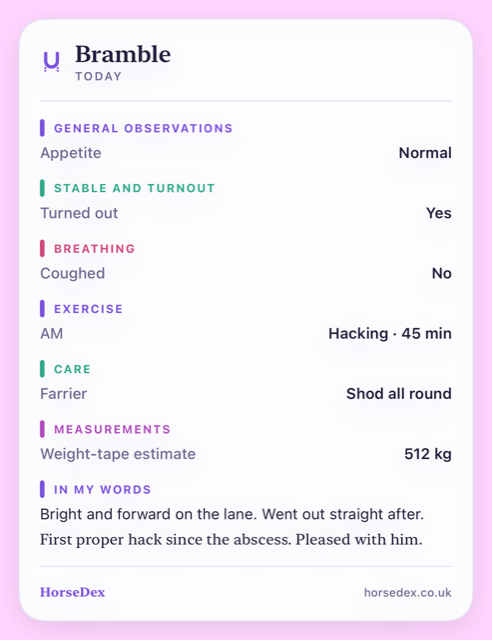
One page for the day, made to be shared. There is a new Diary button at the top of the app, next to settings and export. It lays the day out on a single page — what you ticked, what you rode, who came out, what you weighed — and quietly leaves out anything you did not record that day, so a quiet Tuesday is short and a bad Thursday is long. There is a line of your own to write at the bottom, and you can step back through as many days as you like. Share sends the page as text, and nothing about it goes anywhere near me on the way.
-
Optional
A nudge to write one, only if you want it. A daily reminder can be turned on from the Diary page. It is off until you switch it on, and it asks your permission before the first one.
Finding things again
-
Search
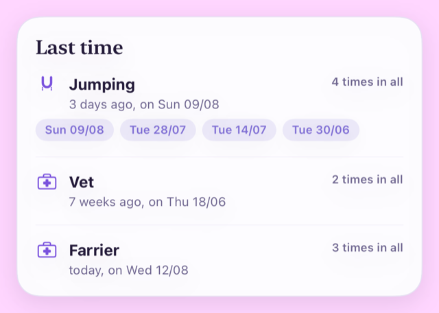
Ask when something last happened. A new search sits beside the Diary button. Type it the way you would say it — “last time I jumped”, “last time I had the vet” — and it answers with the date, how long ago that was, and how many times in all. It looks across everything you keep: what you rode, the visits that happened, episodes, medication, weights and scores, the things you tick, and the words you wrote in your own notes.
The log and the report
-
Log
The log screen folds up. Once you are tracking a lot, the log page got long and busy. Each group now has its own colour and folds away with a tap, and it remembers what you closed, so the screen opens the way you left it. A folded group shows a small count when there is something recorded inside it, so nothing hides.
-
Turnout
Whether they went out at all. Turnout let you record the detail but never the fact, which is no good when your horse does not live out all year. There is now a plain Turned out — yes, no, or leave it alone — and switching the group on brings it with it.
-
Report
A graph you do not want can be switched off. Every countable thing you track now has its own “chart it on the Report page” switch. Turn it off and the field carries on being recorded, exported and included in the report for your vet — it just stops drawing a graph. Tracking that the fly mask went on does not have to mean looking at a chart of it.
-
Report
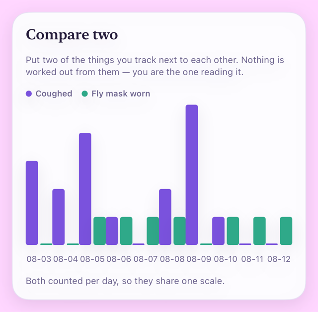
Two of them, side by side. A new Compare two card puts any two of the things you track next to each other. Where they are counted the same way — coughs against fly mask, say — they share one chart. Where they are measured in different units they are stacked one above the other on the same run of dates instead, because putting a cough count and a temperature on one scale would suggest a link the app has no business suggesting. It shows you both. What they mean is yours, and your vet's.
Planning
-
Plan
The week fills itself in from your answers. Tell it how many times a week your horse works, how many days in a row they can, when you usually ride and what counts as work — plus anything gentler that can fill the days between. It then lays out the week, spreading the sessions rather than stacking them, working around the commitments you have already booked, and saying so when fewer sessions fit than you asked for. Every slot is still yours to swap, and a blank week is still there if you would rather start from nothing.
Also
-
Privacy
The privacy policy has been brought up to date. It now says plainly what happens if you email support, what the company serving the website can see, and that HorseDex still holds nothing of yours. Nothing about the app changed — it is the same promise, written more carefully.
Something to hand the vet, and a journal that comes back
You can now export everything you have recorded as a report to give your vet or whoever is covering for you — and if you ever lose the app, it offers to bring your journal back.
-
Share
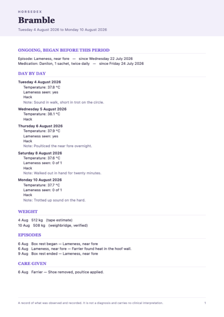
A report you can hand to your vet. Export now produces a proper document rather than a wall of text: your horse's name, the dates it covers, then every day laid out with what you recorded, followed by weight, episodes, medication and the care that was given. It opens on the last seven days, and you can widen it to whatever the vet has asked for. It leaves by the normal share sheet, so send it however you already send things — nothing goes anywhere near me on the way.
-
Records only
Anything still running is shown at the top. An episode you opened three weeks ago, or a course of medication started mid-run, is listed as ongoing with the date it actually began — so a week's report does not make a long-standing problem look like it started on the Monday. Nothing in the report is flagged, ranked or shaded, and there is no summary telling anyone what it means. Every reading in a day is listed rather than averaged, because the odd one out is usually the one worth seeing. It is a record of what you wrote down, and the reading of it belongs to your vet.
-
Fixed
If you lose the app, it offers your journal back. HorseDex keeps a copy of your journal in your own iCloud. On a fresh install it now looks for that copy and offers it to you, showing the date and how much is in it, with the choice to start fresh instead. Underneath that, a real problem is fixed: the app was looking for backups in a way that would usually have missed them on a phone that had just installed it — which is exactly when you would need one. Your existing records are untouched.
-
Backups
It backs up when you come back to the app. The daily copy used to be taken only when the app was started from cold. If you left HorseDex open in the background and simply returned to it, days could pass without a backup being made. Coming back to the app now counts, so 'about once a day' is true rather than hopeful.
Seasons record what you saw, and why
A season is more than a date, so there is now somewhere to put the behaviour and the reason.
-
Mares
A tick, what changed, and a note for why. Alongside marking the day she was in season there is now a tick for her behaviour changing and a line to write in — the sort of thing that explains it, like a stallion moving onto the yard. A season is not a cycle you can count on: it can be brought on by another horse arriving or simply by the weather. So the app will not tell you when the next one is due, and never will. It keeps what you saw, in your words, and leaves the reading of it to you.
The icon, with more room to breathe
The app icon drops the name from underneath the horseshoe.

-
The look
The name has come off the icon. Your phone already writes HorseDex underneath it, so having it inside the icon as well said the same thing twice and left the horseshoe smaller than it needed to be. The mark now fills the tile. The version with the name is still used where it earns its place, like the picture that appears when somebody shares a link to the website.
A proper icon, a condition score that says which scale, and seasons
The app has its own mark at last, you can keep a body condition score without the number being ambiguous, and mares' seasons can be recorded.

-
The look
HorseDex has a proper icon. A horseshoe with the initials inside it, in the app's purple. It replaces the placeholder, and the same mark now runs across the website too.
-
Track
Body condition score, and it always tells you which scale. Recorded like a weight and plotted alongside one. Two scales are in common use and a bare number is useless without knowing which — a 3 is about right on one and thin on the other — so you pick the scale for your horse, every reading keeps the scale it was given on, and the app names it every time it asks and every time it shows you a number. Change the scale later and nothing already recorded is reinterpreted. It records the number you decide on. It does not work one out, and it does not tell you what it ought to be.
-
Mares
Seasons, if you want them. A new group in your daily log, off until you switch it on, for marking the days you saw her in season. It records what you saw and nothing else — it does not work out when the next one is due or judge whether a cycle is regular. Hormones your vet prescribed go in the medication tracker like anything else.
-
Fixed
Two things the Track page was getting wrong. Worm egg counts were being drawn on the weight chart, as though a count in eggs per gram were a weight in kilograms. And the page announced a worm egg count as due, when it has no interval and never can be. Both corrected.
Getting rid of a care item for good
Anything you added to the care register yourself can now be removed outright, rather than only hidden.
-
Care
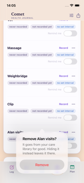
Remove a care item you added, and it is gone. Hiding was the only option before, which is right for something built in like the farrier but wrong for a made-up item you never wanted — often one that arrived with an imported journal. Anything you added yourself can now be removed for good from the menu on its row. Its recorded visits go with it, and so does the tick on any log entry that referred to it, so nothing is left pointing at something that no longer exists. The confirmation tells you how many records that is before you decide, and hiding is still there if you would rather keep them.
Fixing a date you got wrong, and a register that is only yours
Past visits can be corrected, care items you do not have can go, medication can be given on any schedule, and the log screen is a lot shorter.

-
Care
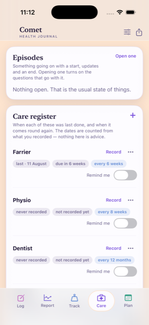
Every past visit is there, and you can correct one. Each thing on the care register now keeps a list of every visit you have recorded against it. Open one and you can change its date, its note and what you wrote down at the time, or take it off altogether. Correcting the most recent one moves the next date due with it, so a date typed in wrong no longer leaves the reminder wrong for good. A visit you ticked on a log entry says where it came from, and its date follows that entry.
-
Care
Hide what your horse does not have, and add what it does. A register full of things that are not yours is noise. Anything on it can be hidden, and everything you recorded against it is kept in case you want it back later. You can add your own care item too, with its own interval — whatever your horse actually has. One you added and never recorded anything against can be removed outright.
-
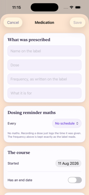
Medication
A dose can be every four weeks, or any other stretch. The schedule used to stop at weekly, which was no use for anything given monthly. There are now presets up to every four weeks, and a custom setting for any number of hours, days or weeks.
-
Fixed
Medication reminders were not arriving. Only the end of a course reminded you. A dose that repeats reminded you about nothing at all, quietly, whatever schedule you had set. It now reminds you on the day the next one is due.
-
Log
The log screen is far shorter. Questions with more answers than fit across the screen used to spread over two rows of buttons each, so a handful of them filled the page. They are now one line you tap to choose from. Anything with two or three answers keeps its buttons, so yes or no is still one tap.
-
Throughout
The editors look like the rest of the app. Opening an episode, editing a medication, recording a visit, settings, export, backup and the plan editors used to appear as plain grey system forms. They now match the app they belong to. The bar along the bottom is frosted glass with the page moving underneath it.
-
Small
Tidier care rows, and removing something asks first. Each row on the register keeps Record to hand and folds the rest into a menu. Removing a care item or a medication now asks before it does it.
The Report page opens straight away
A speed fix on the Report page, and the last of the old name cleared out of the widgets.
-
Speed
The Report page no longer sits and thinks. On a journal with months of entries in it, opening Report used to hang for several seconds before anything appeared. It now comes up straight away. Nothing you have written was touched.
-
Widgets
The widget stopped naming somebody else's horse. Its buttons used to read “Log Hendrix Morning” — the name of the one horse the app was first built for. They now read “Log this morning”, whichever horse the journal is about, and however many there are.
-
The name
It is called HorseDex, everywhere you can see it. The app, its widgets and the privacy policy all say HorseDex now, and there is an address to write to: support@horsedex.co.uk.
The widgets carry the app's own name
One fix, and nothing else. This build changed the widgets' names and left the rest of the app exactly as it was.
-
Widgets
In the widget gallery they were still called Hendrix. The app had been renamed and its two widgets had not, so adding one to your home screen meant hunting for the old name — confusing on a phone that has both apps on it. They are HorseDex and HorseDex Daily now.
The first build
The first build to reach TestFlight, so rather than a list of changes, here is what is in it.
-
Empty to start
It starts completely empty. No demo horse, no sample entries. The first thing it asks is your horse's name and what you want to keep an eye on, and everything you write stays on your phone.
-
It records
It never diagnoses, and it never will. There is no laminitis score, no colic checker and no lameness grade anywhere in it. It shows you what you wrote, side by side, and leaves the conclusion to you and your vet.
The daily log
-
The everyday six
Appetite, drinking, droppings, urination, energy and behaviour. One shared scale across all of them, and they are the only things switched on to begin with. Everything else stays out of your way until something gives you a reason to watch it.
-
Exercise
Hacking, schooling, jumping, in-hand, long lines, lunge, hill work, gallops. A lesson is a tick on top rather than a type of its own, so a schooling lesson still counts as schooling, and the report can tell taught work from solo work.
-
Which way is better
You decide what counts as good news. Lying down more is a comfort for one horse and an early warning for another, so when you switch a field on you say which way is better — or that neither is. Nothing is assumed.
Care and appointments
-
One register
When each was last done, and when it comes round again. Farrier, physio, dentist, saddler, vaccinations, worming, plus the vet, massage, weighbridge and clip. The intervals belong to each horse, not to the app, and you can change any of them.
-
Book it in time
The reminder is to book, not to panic. A nudge a month ahead so you get in before they are full, then a chaser two weeks before it is due. Booking it silences both, because getting it booked was the whole point.
-
Worming
Which wormer you used, not just when. The register shows the product beside the date, so the rotation is something you can look at rather than something you have to remember.
-
Vaccinations
Batch numbers are kept with the date. Off the vial or the passport sticker — it is in front of you for about a minute and wanted for years.
-
What happened
A booking never turns itself into a visit. If the farrier is booked for the 5th and comes on the 12th, the next one counts from the 12th. Nothing is assumed to have happened just because it was in the diary.
When something goes wrong
-
Episodes
A colic, an abscess or a lameness keeps its own thread. One thing with a beginning, updates as it goes on, and an end — instead of scattered ticks across a fortnight that never quite tell you it was all the same problem. More than one can run at a time.
-
The right questions
Opening an episode switches on what is relevant. Start a foot episode and the feet questions turn up: digital pulse, hoof temperature, whether a shoe came off. Close it and the app asks whether you want to keep tracking them rather than deciding for you.
-
Box rest and photos
Box rest belongs to the episode that caused it. With a start and an end you can change. You can attach photographs or video to any of it — a wound healing over ten days reads better as pictures than as words.
Medication
-
As prescribed
Name, dose, how often, why, and a photograph of the label. Written down the way the vet wrote it. The app works out the next dose from the interval you enter and suggests nothing of its own.
-
Courses that end
A course with an end date reminds you on its last day. And then stays on the record. Finishing is not the same as disappearing.
Weight and other measurements
-
Two kinds of weight
Tape estimates and weighbridge readings are drawn as separate lines. A weighbridge is the truth when you have one; the tape shows the direction in between. Averaging the two together would have hidden both.
-
Worm egg counts
Counts are tracked over time in eggs per gram. Alongside weight. They are on nobody's schedule, so the app will never tell you one is due — when to count is your call.
Your horse's profile
-
Standing facts
The things that are true all the time, not just today. Previous laminitis, EMS, PPID, a cresty neck, fat pads, asthma, arthritis — tick what applies and add a note in your own words, such as which year it was. Add your own if something is missing.
-
Never added up
They sit on one screen and stay there. No score, no risk level, no traffic light. Leaving one unticked means you have not recorded it, not that the answer is no — and the app never works one out from anything it has seen.
Yours, and private
-
No account, no server
There is nothing to sign up for and nothing is sent anywhere. No analytics, no tracking, no advertising. What you write is on your phone and nobody else can read it, including us.
-
Lock and backup
Face ID or your passcode can lock it. And you can keep a copy in your own iCloud. Photographs travel in that copy; video never does, because one clip can outweigh years of writing. Anything left behind is named, so a restore tells you what did not come back.
-
More than one horse
Add a second and everything separates cleanly. Entries, weights, appointments, medication and the profile all belong to one horse, and the app stays out of your way while there is only one.
On your home screen
-
Three sizes
A widget that changes with its size. Small shows what you have logged today, medium the last fortnight as small charts, and large the week ahead. Tapping any of them opens the app at the matching screen rather than the front door.
-
Daily
A second widget for today and tomorrow. What is planned for both, today's counts, and a shortcut straight into the log.
-
Already filled in
Tapping through arrives with the right thing selected. If the plan says schooling this afternoon, the log opens on that afternoon with schooling already picked, so you confirm rather than retype. It never records anything on its own.
Hendrix, the iPhone app it grew out of
30-07-2026 to 10-08-2026
Before HorseDex there was a private iPhone app built for one horse and one owner. HorseDex was made from it on 10-08-2026, so most of what you use started here.
Summarised from the project's own notes, which is why some entries cover several builds at once.
A complete copy of the journal, in one file
The last thing the older app gained: a way to hand its whole history to HorseDex.
-
Whole journal
Export a full copy, not just a date range. Every entry, the weekly plans and their earlier versions, appointments, weights, and anything edited or deleted along the way — one file, which HorseDex reads. The older exports for the vet stayed where they were.
-
Nothing is moved
A copy is a copy. Exporting changed nothing in the app it came out of, and bringing the same file in twice added a second copy of nothing.
The widget stopped going blank on a Sunday
One fix, spotted on a Sunday, to the widget that showed today and tomorrow.
-
Sundays
Tomorrow said “Nothing planned” on a Sunday. The widget only ever looked at the week it was already showing, so on a Sunday a week that had been planned came up empty. It reads into next week now, and so does whatever it picks out as the next thing due.
Today and tomorrow, on the home screen
A second widget, and the fix for the sizes that refused to be picked.
-
Daily
Today on the left, tomorrow on the right. Each with its morning and evening plan, a tick against whichever half of the day was already written up, and one button that opened straight onto the log.
-
Widget sizes
All three sizes could be chosen again. Adding a widget offered small and large greyed out and refused to take them. Small, medium and large all worked after this.
Home screen widgets, in three sizes
The journal on the home screen, so the day could be checked without opening anything.
-
Small
Has today been written up? Two ticks for morning and evening, the day's counts underneath, and a button onto whichever half was still missing.
-
Medium
The last fortnight as small charts. Exercise and the day-to-day counts drawn out, with the latest weight and how much it had moved.
-
Large
The whole week's plan. Every day with its morning and afternoon slot, colour coded the same way as the app, today's row picked out, and appointments listed underneath.
-
Always current
They kept themselves up to date. Writing an entry or changing the plan updated them; there was nothing to refresh.
A colour-coded plan, and more room to read
A look-and-feel update to the weekly plan. Nothing logged or planned changed.
-
Colour coded
Appointments red, extras green, exercise purple. So a glance at the week said what each day was actually asking of you. It applied to the week being planned and to every week already saved.
-
More room
The bar along the bottom and the title bar both shrank. The heavy strip behind the buttons went, and the title bar stopped leaving a large empty gap at the top of every screen.
Social ride, and four things that were wrong
A small update built from what its tester reported. Everything already logged stayed exactly as it was.
-
Social ride
Social ride joined the weekly plan. As one of the fixed commitments, counted as a workout, so the planner would not stack another session onto the same day.
-
Recent list
Extras showed up in the log again. Massage, baths, appointments and the rest saved correctly but stayed invisible in the recent list. They appeared as small tags on each entry after this.
-
Custom minutes
The Custom duration button did nothing when tapped. It opened a box for any number of minutes after this.
-
Weight chart
“All time” cut off older readings. The chart ignored anything older than the first journal entry, so early weights never appeared. All of them showed after this.
The first iPhone app
Builds 1 to 6, all in one day: the move off the browser and onto the phone, ending with a fix for text that came out unreadable in dark mode.
-
Log, report, track
The journal, its charts and the care list, native on the phone. Written and read entirely on the device, with an undo bar for the entry just made, and entry editing by tap or swipe through one shared form.
-
The weekly plan
A plan that could be saved, reopened and rolled forward. Earlier versions were kept rather than overwritten, so a week could be restored as it had been, and any slot could be edited by hand.
-
Exports
A spreadsheet, a PDF or a plain summary, for the dates you chose. Shared out of the app the ordinary way, for taking to an appointment.
-
Dark mode
White text on white had made whole screens unreadable. The app settled on its light colours whatever the phone's appearance was set to.
Hendrix, the web app
08-07-2026 to 08-08-2026
Where all of this began: not an app at all, but a page you opened in a browser on your phone and could keep on the home screen.
Summarised from the project's own notes, which recorded the work by the week rather than by release.
Switched off
The web app was retired once the iPhone app could hold everything on its own. Nothing new went into it after this.
-
Retired
The browser version stopped. Its records had already moved to the phone, and keeping two places to write the same thing down was the thing worth ending.
Trends, a target weight, and a plan that fitted the screen
The last round of real changes to the web app.
-
Weight
A target weight, drawn on the chart. With the readings joined up as a line so the direction was visible, and a plain marker of whether it was moving towards the target or away from it.
-
Measurements
Readings taken now and then got their own history. Rather than being lost among the daily entries.
-
The plan
The weekly plan fitted one phone screen. The plan came first with the week picker folded underneath it, and earlier versions of a plan were kept rather than replaced.
Any number of minutes, and a planner that did not wipe the week
Two changes to how a week was put together.
-
Custom duration
An exercise session could be any number of minutes. Instead of only the lengths on offer.
-
Apply changes
Suggested changes swapped individual slots. Rather than replacing the week you had already put together.
It said so when saving went wrong
A round of work on the quiet failures — the ones where something looked saved and was not.
-
Saving
A failed save said so instead of failing silently. Both when writing something new and when removing it, and a page that had got itself into a mess recovered rather than refusing to start.
-
Checks
Entries were checked before they were stored. Dates, numbers and lengths, so a malformed entry was refused at the door rather than written down wrong.
-
Offline
The offline copy stopped serving the wrong thing. A missing picture or stylesheet used to come back as the page itself, which broke it in odd ways.
Lying down as good news
A correction to a trend that had been reading the wrong way round, and a plainer error when a save failed.
-
Trends
More lying down was being shown as a worsening. For this horse it was the opposite, so the trend was flipped to count it as an improvement. It is the reason HorseDex asks you which way is better rather than deciding for you.
-
Errors
A failed save came back as a broken page. It came back as a plain message after this.
The first version
A page you opened in a browser, with the whole idea already in it: write down what you did and what you saw, and read it back.
-
The journal
Daily observations, exercise, appointments, weights and turnout kit. Written on the phone, in the yard, in the order the day happened.
-
Reports
The record read back as charts and summaries. Which was the point of writing it down in the first place.
-
On the phone
It could be kept on the home screen like an app. And it still opened when the signal did not. Records were kept in one place, so the same journal opened on whichever device you picked up.